iOS call screen redesign

We all know that iOS has come with this recent design that is terrible with all things considered. The cognitive overload is real. I understand it is a tricky situation but an interesting problem that still requires a solution. According to me, every problem — personal or professional has a solution. Therefore, when I came across this problem online, I have been wracking my brain thinking about a solution. In fact, I thought so much that I started having dreams about it as well. I like to solve problems that I find challenging enough which is the main reason I am shifting my career from a graphic designer to UX designer.
*Please note that I am not employed by Apple and this case study is just out of interest done on my own accord.*

*I am a hardcore android user by the way; love Mac laptops but when it comes to a phone I will choose android over iPhone any day.*
Currently, there are three options users have:
- End the current call and accept the current call.
- Decline the new call and continue your current call.
- Put your current call on hold and accept the new call.
In my opinion, it is understood that users would like to have all these three options. Therefore, we need to keep them all and still manage not to make users feel overwhelmed by wondering what to choose within a limited timeframe. There are several issues with this particular design. The issues that bothered me is the following:
The number of buttons makes me think there are more than three options other than the remind me or message option.
There is just too much happening within the given amount of space.
When I researched about this, I read an old article that mentioned the following issues:
It is unnecessary decision making in the 10 seconds before the new call goes to voicemail (users can increase it to more than 10 seconds in settings).
It’s too specific about what’s going to happen to the current call
One issue is that the red circle with the hung-up phone doesn’t mean the same thing in both cases (they have tried to fix this issue by replacing the hung-up icon with a cross).
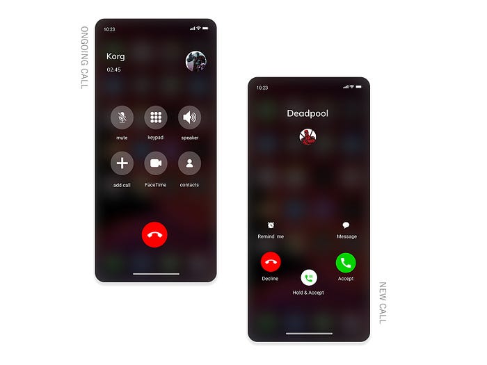
This screen breaks the muscle memory. We don’t panic when the first call arrives because there are two clear options (if the phone is unlocked) — Accept on the right and Decline on the left. Whereas, now Decline is in the middle.
It is the same exact location as the big red end button that does end the current call before (and after) the incoming call arrives (reason why many users end up cutting both calls accidentally).
This problem now sounds bigger than when I started right? Anyway, I think I may have a solution that addresses all this issues I mentioned above about the original UI.

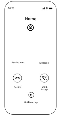
I quickly made a lo-fi prototype so I can test it. I tested it with 2 iPhone users and 2 android users. I got constructive feedback and changed my final design solution accordingly.
Solution
My solution is slightly tweaking the button colors and reduction of the number of buttons. I changed the hold & accept button by moving the two icons into a single button, reducing the size and moving it below as in accept (the function here should be — if you accept the new call, your ongoing call gets automatically cut) & decline are the primary two options. I read a twitter comment that said “they should only keep the two options — accept and decline”. However, based on my observation and my user research, I decided to keep hold & accept as an option because it is quite common for people to choose that option.

Thank you for reading my article! Any feedback or suggestions will be deeply appreciated. And please feel free to connect with me on LinkedIn and check out my work on Dribbble.
